Did you know that NARIC started as a small collection of books and reports back in 1978? A lot has changed in the last 45 years: the collection now includes 150,000+ publications and 300,000+ database records, online access to thousands of products from the NIDILRR grantee community, bilingual information specialists available to help patrons connect to resources, and social media channels to share our work with the world.
As we celebrate our 45th year, we are refreshing our look, including our logo. We wanted a logo that conveyed the multifaceted experience of disability and rehabilitation along with the importance of information and research in creating knowledge that supports independence and participation. That’s a lot of information to convey in a small space! Our design team created dozens of potential graphics and we’ve narrowed it down to three choices. We would love to hear from you as you are an important part of this community. Take a look at these options and give us your feedback!
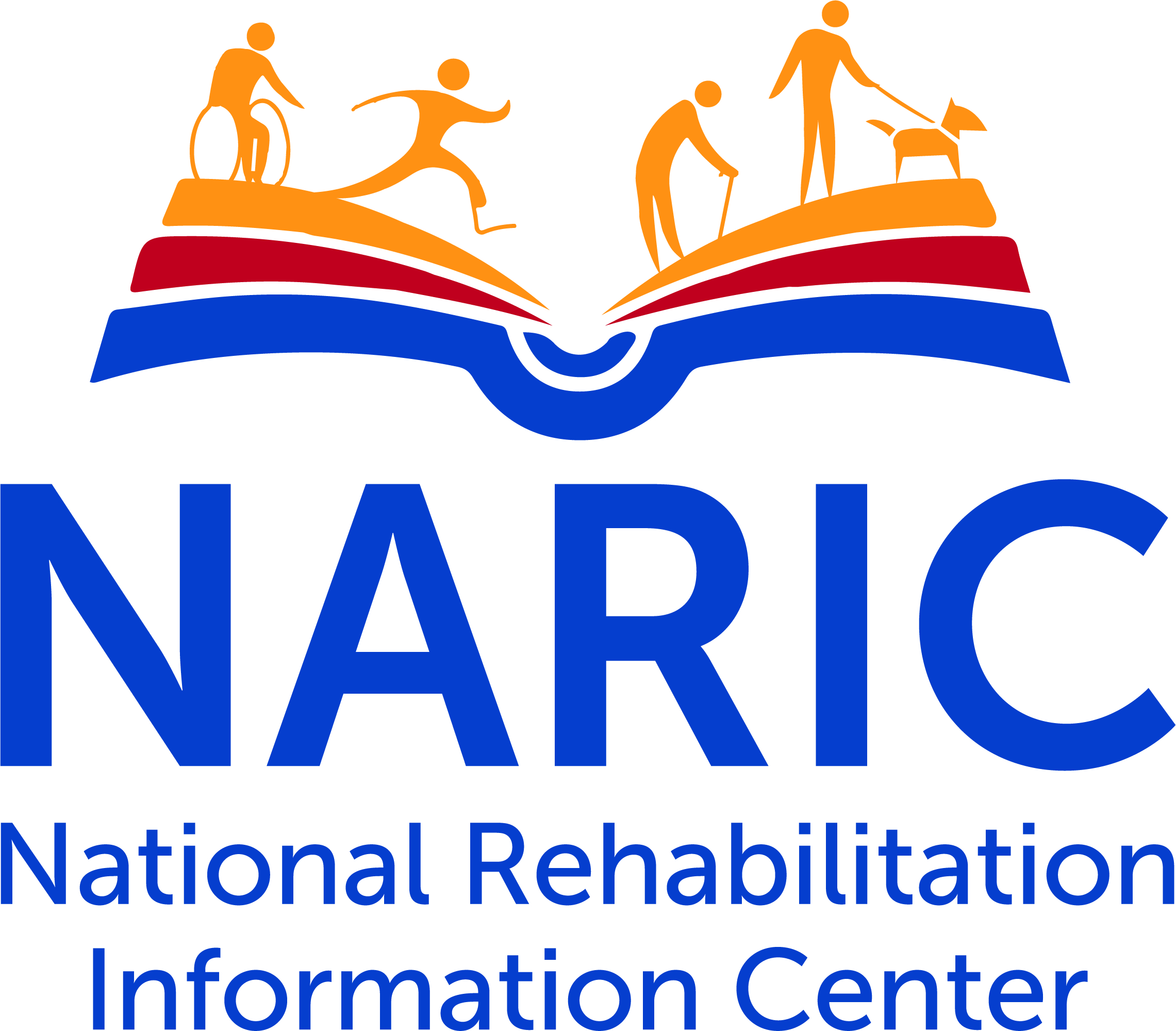
Open Book Option: This logo features the NARIC acronym above National Rehabilitation Information Center in dark blue, topped with a shape representing an open book. Four figures move across the top of the open book, representing diverse community of people with disabilities. View a larger version of Open Book Option.
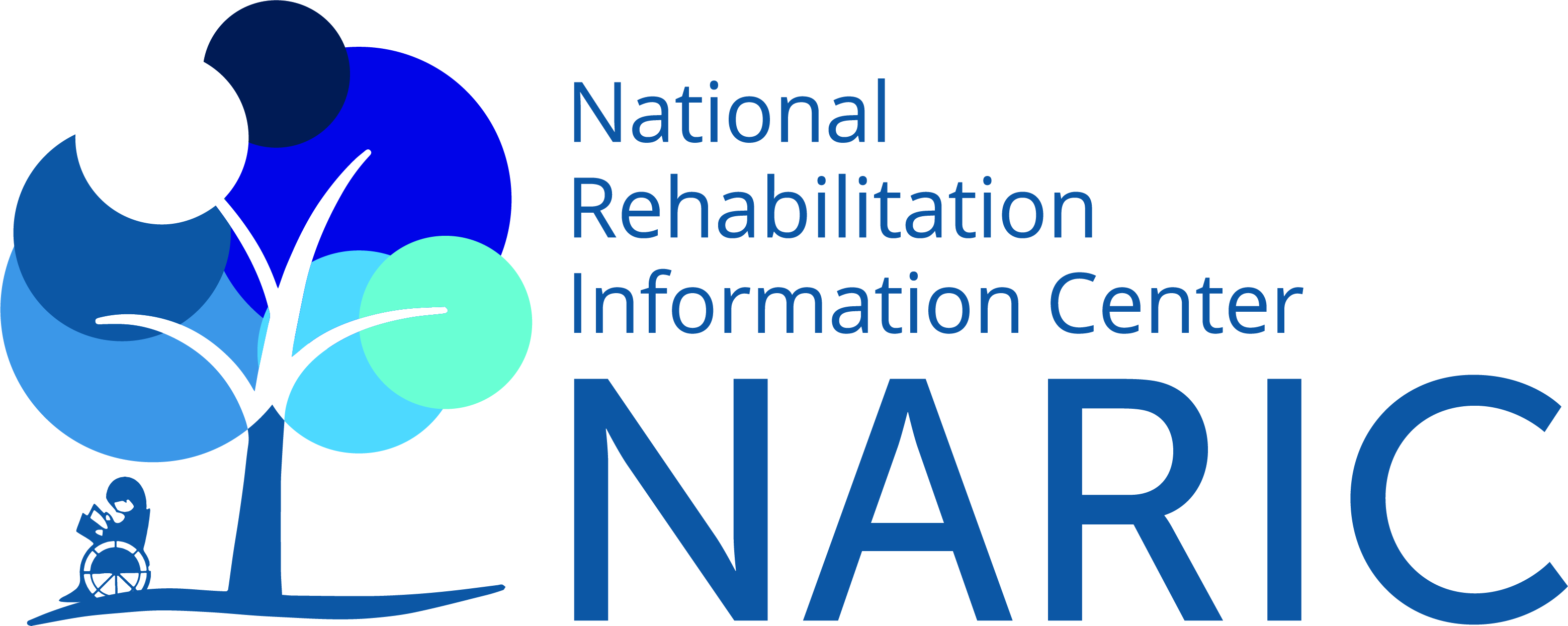
Blue Tree Option: This logo features the NARIC acronym and text in navy blue positioned to the right of a tree. The tree features overlapping circles in various shades of blue and one of white, representing the intersectionality of the disability community. An icon of a person sitting in a wheelchair reading a book is under the tree. View a larger version of Blue Tree Option.
Rainbow Tree Option: The NARIC acronym with text below it in dark blue, both positioned to the right of a graphic. A tree rises out of an open book, the tree leaves are grouped in red, yellow, green, and blue. The book pages are orange, red, and blue. View a larger version of Rainbow Tree Option.
Please send your feedback to naricinfo@heitechservices.com and use the subject: Logo feedback. You can also use the comment box below to share your feedback. Stay tuned for more updates!
Pingback: Es hora de un cambio: ¡Ayúdenos a elegir un nuevo logotipo de NARIC! | Collection Spotlight from the National Rehabilitation Information Center
I think the first image capture NARIC well!
Recommend the “Open Book” option for its comprehensive, yet inclusive, neutrality.
My first choice is the open book option. I think if NARIC as a wealth if resources and one stop for published and non published content. I like this image and representation.
My second choice would be the rainbow tree coming out of the open book. I like its symbolic nature of the rainbow that disability and its issues represent in society.
My favorite logo is the Open Book Option. Thanks!
I think the rainbow leaves the false impression that NARIC is an LGBTQ+ organization–when that is not its main focus. I think the tree with a bit taken out is a confusing symbol. What does it signify. A person in a wheelchair is clear but does not represent the cross disability nature of the info. I think the first symbol–if the figures were redrawn ( a little more aesthetically pleasing makes more sense to me personally.
I agree with Marianne’s comments. The figures in the first one are more inclusive of different forms of disability. I would like to see that image indicate some additional form of inclusivity – if not rainbow, then perhaps different shades/colors of figures.
Maryann Davis
Logo feedback: all are acceptable. I like the 1st one best followed by #3. The tree in #2 looks like a bit has been taken out of it. Yes – time for a logo refresh!
although I love trees, I think the logo with the book and the people is most relevant
This looks great! I like the open book option – it reminds me of a sunrise or a new day.
I prefer the Open Book Option, as it best reflects the diversity of disability community we serve. The Blue Tree seems limited in this representation. The Rainbow Tree is aesthetically pleasing, but does not reflect your mission as directly; plus it reminds me too much of the logo for the Association of Rural and Small Libraries.
I like the open book option – it captures NARIC’s identity in a picture which is what a logo is all about.
I think the first logo best represents the work of NARIC. I found the two images with trees a bit confusing.
I think #1 is my preference. I like the variety of disability represented and the opening book depicting the sharing of knowledge. Hope this feedback helps! Best, Kelly Mack
I like the first option. Although, if the third option was not in rainbow colors for the tree, this would be my favorite option
I like the first option best!
I think the open book option is best.
I agree with those liking the first image. It is more inclusive of different forms of disability. I would like the figures to represent additional inclusion, perhaps with different shades or colors for each figure. Maryann Davis
I like Open Book the best with the Rainbow Tree second.
I like the open book option
The first (open book). It will be easier to work with since it can be formatted into a square or a rectangle. I also like that it has more representations of people (the one with the solitary wheelchair figure feels like it is narrowing the definition of disability to the public imagination’s stereotyped ‘common denominator’). Also, a book speaks to modern concepts of information, whereas a tree only does in Biblical terms.
I agree with others that Open Book is my favorite, followed by the Rainbow Tree.
#1 – captures goal of NARIC in a nice visual.
Yes, time for a refresh. I also love the first logo (open book) for the reasons others have given. The tree options are fine, but not optimal.
I really like the ‘book’ option (#1) as it is clean, clear and modern.
Open Book Option
I would like to see them all in a smaller version. So much of what we see today is on our phones – and the logos must be able to be relevant when very small. 1 and 2 have people who become specks when scaled down. 3 is easier to scale down and still have meaning. The rainbow implies a social agenda – I think it would be just as strong and less confusing with only two or three colors – Mark
I think the Open Book logo best fits NARIC.
The logo with the tree and the overlapping circles is the one that grabs me. However, all are great
Michelle
I like the Open Book Option the best. It is the most inclusive of the three logos.
I like the open book, the first logo. I think it describes NARIC well.
Difficult choice, but it is time for a new logo. Those unfamiliar with NARIC may see #1 and especially #3 as representing LGBTQ rather the large spectrum of information NARIC offers. I like number 2 with the person in the wheelchair being under the cover of the tree but the actual tree not so much. I would like to see a blending of 1 and 3 with the pages of #1 a bit smaller like in #3 and the figures a bit larger or maybe a few less. That is my 2 cents worth and a bit more. Good job.
I like the open book option. I think it is the best.
I like the open book option. I think it is the best.
I vote for option #1
Prefer open book logo
I prefer the open book (option 1)!